Here is a quick run-down on what you will find in this bulletin: Changes To…

Update News for September 2023
Here is a quick run-down on what you will find in this bulletin:
-
-
Progress On New CQS.EXE
-
“Client Entry” For a Single Life
-
Changes to Look and Appearance
-
Goodbye Delphi – Thanks for the Memories
-
Some Things Should Look The Same
-
Our Current Programming Plans for 2023
-
These topics will be dealt with in more detail throughout this bulletin.
CQS.EXE is the new program that will eventually replace your current GOWIN.EXE. GOWIN.EXE is the windows program that currently runs your Compulife quoting system.
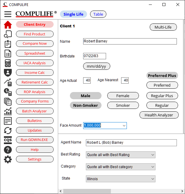
While we are NOT yet ready to release the new program to you – we are getting closer and closer – we wanted to share some screen shots to let you see how it is progressing as we test and refine it.
IMPORTANT: Click on the image for a larger copy of that image.
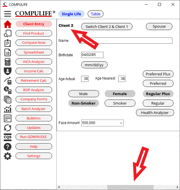
If you then choose multi-life, where you actually need and can enter Client 2, you can use the horizontal scroll to display Client 2.
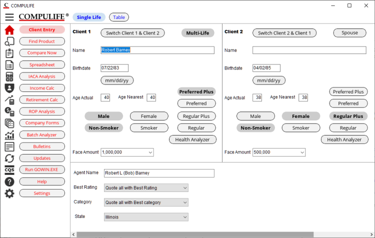
Alternately, if you prefer, you can just make the client entry window wider, and then you are able to show both client 1 and client 2 at the same time:
NOTE: The Client 2 box ONLY appears if you click on the “Multi-Life” button in the top right of the Client 1 window. If you click on the multi-life button and see Client 2, it means that when you run a comparison it will actually show the combined total cost of both lives. That will be the default comparison if you selected multi-life on the client screen. You won’t have to go to options to see the comparison for both as you do now. Of course you can still use the previous options on the comparison window to change from multi-life to a quote for just Client 1, even though you chose multi-life on the client entry screen. And as you can do now, you can switch Client 1 with Client 2 from the comparison window and see the quote for Client 2, who becomes Client 1 when you switch them.
What we have tried to do is make this more intuitive. If you are ONLY doing an individual quote then you just see the Client 1 on the client entry screen, and when you run the comparison you just see the quotes that are for that single client. If you have activated multi-life on the client screen, and you see both clients, then you are doing a two person multi-life quote (two single life policies billed together).
Changes like this may not mean a lot to existing subscribers, who know how to make all this work already, but we think this will be much more obvious for those who infrequently use the program or who are new prospective subscribers.
Look/appearance is only one of three things that we are trying to accomplish with the new program.
-
-
- 1. Improve the look and appearance – make it look more modern
-
-
-
- 2. Make program options more logical and intuitive
-
-
- 3. Remove the old user interface development tools
Showing you these screens in advance, and asking for your feedback is to hopefully elicit from you comments that can be incorporated before we roll out the program. We are open to “better” ideas, and if you have any, we would like to hear them from you sooner rather than later.
Look and appearance is always “in the eye of the beholder”. Everyone has a different idea about how a program should look, just like everyone has a different idea about which color you should paint your kitchen.
The main influences on us as we redeveloped our look and appearance were platforms like YouTube and Google where the graphic button and vertical/horizontal menus seem to be the standards. Of course we compared those sites with others to make sure there wasn’t a better way to do it, but that seems to be the trend.
We have also emphasized that our ultimate goal is to have a version of Compulife on the web that has the same look and function as the Windows program. Therefore, what has governed our design is what we have seen on the web, with the view that we can make our web based program look the same and, more importantly, function the same.
The only thing that makes any website more attractive is lots of photos and graphics. But at the end of the day Compulife is a tool, not an advertisement. We know that the above menu and client screens look “busy” but we want as much content on one page as possible.
We specifically do not want multiple page displays with a lot of pretty graphics. Frankly, that stuff annoys regular users who have to keep flipping from page to page to get the information entered. WORSE, if you need to change something that you entered three pages earlier, you have to flip back 3 pages to change it. On the above screens you see it all, fill in the client information, then click to get the quote. If you need to change something, you close the quote, make the change and redo the quote. Busier screen, but it’s enter, click and quote.
The one exception to this is the Preferred Health Analyzer which will take you to a different window where you step through the questions. That is much too much content to place on the client entry screen, and we believe the analyzer is not used all the time when running quote. Agents go to the analyzer when they believe they have a client who is border line on a particular underwriting issue.
Many quoting websites, geared for consumer use, use the page by page by page data entry approach. That’s all cute and entertaining for a first time user, but I can’t imagine ANY agent, who is going to be using a quoting tool regularly, wanting to go through all that BS every time then want to get a quote.
To summarize, those are not the kind of suggestions that we are looking for. What we are really looking for are organization of choices and options on the screen. Is there a way to display the information that would be more logical and intuitive. We like what we’ve come up with, but can it be better? Please let us know.
While Delphi made it easier to put together new stuff for Windows, you were limited in how you could do things. Further, there is no easy way to use Delphi and make something from it that runs on the web.
In addition our programmer is constantly frustrated in that he is really using two languages to program our Windows software. Chris has been much, much happier as he gets the program converted entirely into the C++ language.
Fortunately, as a software company, we are not alone in making this transition. There are now third party tools that are available that help make the conversion from Delphi to C++. Like most tools they get about 80% of the job done, but they have potholes in them that require a lot of fine tuning to make the newly converted code work. On top of that, there is a lot of fat on the cow, and a lot of optimization that can be done once the conversion has been made to work. All of that work has been going on these many months.
And then throw in the new “look and appearance” changes, the reorganization of some of the features and functions, and it is a LOT OF WORK and our programmer’s hands have been very full.
Having said all that, as we get closer to the end product, we think the work and the wait has been worth it.
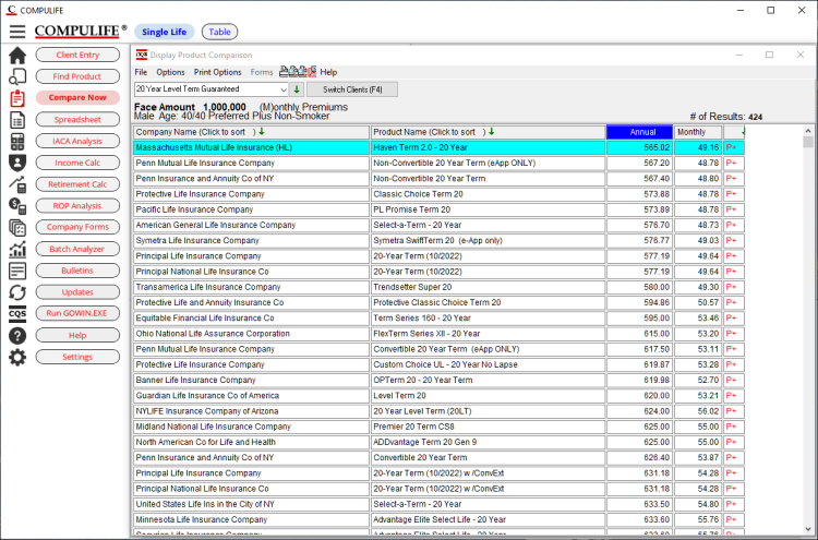
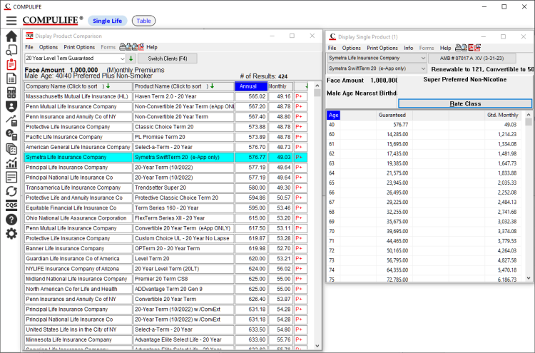
No one complains about the look and feel of that, so if it isn’t broke, we don’t want to fix it. Having said that, you can see there is still work to do on that screen. The shortcut icons for print preview, create PDF, create PDF and email are all bunched up and crowded. Some of the fonts in the header are wonky and the text is spaced badly. This the fine tuning that we have to keep doing, on top of fixing bugs in the code. But it’s getting good enough to give you a first look and while there will be more changes to come, they will be small changes.
And you have LOTS of options to change the display. Here’s the same comparison windows, which I have narrowed up. I then double clicked to display a single product next to it. I also moved the comparison window to the left, so that it covers the text buttons on the menu, but leaves the icon menu button column displayed. I like this display, what do you think?
NOTE: If you were to close the comparison window the entire menu and client screen would re-appear as you saw earlier.
ALSO NOTE: I personally prefer windows that are as narrow as possible, without losing important information. I tend to read fast and provding that I don’t have to move my eyes back and forth, like you have to for a wide display, the narrow display lets me read more quickly.
Once again, a lot of fine tuning to be done here, but it is coming along very nicely, and we thought it was time to give you an update on the progress. We are not sleeping at the wheel and a lot of your subscription money is being ploughed back into the software to make it better and better.
-
-
- Introduction of New PC Version: CQS.EXE
-
-
-
- Overhaul Of Current Product Data Files
-
-
- Introduction of Compulife Mobile Plus (with Pick 12)
Anyone with questions about any of these upcoming projects can call Bob Barney to discuss:
(888) 798-3488
Please don’t email me essay questions, just call. If I’m not in, email me your phone number, I’ll call you.
These planned objectives will easily consume our programming time during the balance of this year and throughout 2023. The good news is that once the product data files have been converted, and we have introduced the new CQS.EXE, and upgraded our internet engine to use the new data files, Compulife will be turning it’s full attention to our web based, Compulife Mobile software. The long term goal is to have a web based product that does everything our PC based software does.

